EMMA MACEY
ARTIST | TEACHER
MA Project Work in Progress
Rites of Passage -Armour
This sculpture addresses the primary issue that I encountered in the Desert Forms Project. It is an attempt to craft an object that could be worn during an initiation ceremony involving my family who have experience of two quite different island cultures: the coastal Australian culture and the semi-rural British culture.
The armour represents the British culture: fiercely proud, wealthy and combative with a history of conquest. The form represents the Australian culture: it is inspired by a manta ray, a creature whose barb warns off predators, whose wings seem protective and a creature who moves through the water with majesty.
Rays have a sense of mystery and power that is appropriate for an initiation ceremony. They have similar qualities to birds and so they are a natural progression from the Flight Series I completed earlier in the year but they are more pertinent to this project than birds because they are an oceanic creature. This is important both because the ocean is part of my heritage (I spent much of my childhood in or close to the ocean) and because water is a symbol of life and faith (as discussed in The Hospital Series).
For further notes on how object agency infomed this project, click here.


 Sketchbook IManta rays were my primary inspiration, but I also integrated the fluid lines of the Flight Series willow sculptures into my initial armour designs. I worked on folded tracing paper so that I could see both the front and back of the design at once. | 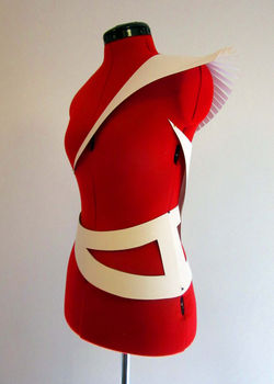 Paper maquetteThe object I used as a prop during the Chapel Talk I delivered about objects with agency and their importance in rites of passage rituals (transcript available at Theoretical Content>Rites of Passage) |  Paper maquetteI chose to use copper because while it is not the strongest metal, nor the one customarily used for armour, the colour gives it a warmth that is appropriate for the project. I was also familiar with how to etch copper and I was keen to etch the copper with the rippled patterns of water. I also wanted to felt a textile underlay because I want to involve a softer protective element akin to the soft blankets in which one wraps an ill child or a newborn. |
|---|---|---|
 Copper tests.jpgI spent a number of hours testing the copper as I used nitric acid rather than ferric chloride to etch it; it was the safer option in the studio where I was working. This meant that the method of inscribing into hard ground on zinc that I usually used didn't work. The process was volatile and the copper etched quickly. I found that I had to use stop out ground rather than hard ground. I had more success if I focussed on the impression that was made on the metal rather than the potential print. | 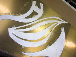 I Adhere paper pattern to copper | 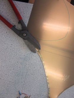 II Cut copper with tin snipsI ordered thin sheets of metal so that I could cut and mould it by hand as my access to industrial equipment was limited. |
 III Refine edges with safety shearsUsing safety shears limits the distortion of the edges. This was a laborious process and gloves did little to prevent blisters so I found I could only cut one shape a day. |  IV Bevel edges |  V The final shapes |
 | 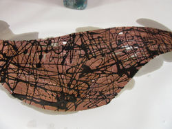 VI Apply stop out ground |  VII The first etchThe mordant was 30% Nitric Acid. |
 The first etchI etched this panel twice. The first time I etched large sections so that some areas were thinner than others. I then dripped hard ground over the same panel and etched it again to create a more interesting texture. |  VIII The second etchI waited until the mordant bit through the copper in the thinner sections before removing it. The mordant frosts the metal so areas that have been coated in stop out are distinct both because they are thicker and because they retain a glossy finish. |  The back of the second etchI used the mordant to create the internal voids as I was unable to use tin snips in the centre of the panels. In some cases, like the belt section, this created a wonderful mottled edge. |
 IX PrintThis particular panel was etched quite deeply so I was able to create a relief print from the plate. I used an intaglio press rather than a barren to print so that the cotton paper was embossed with the wonderful texture of the plate. This damaged the fragile plate in some areas so I could only create a very limited edition. I printed in layers, Prussian Blue overlaid with a tinted blue that seemed almost translucent. |  Wrist piece |  X Cut and mould panelsThe mottled edge of this particular panel were quite sharp making the piece more sculptural than wearable. |
 Hard ground variationHard ground can be diluted with white spirit and dripped onto the copper so it is good for representing water but when the mordant is strong it flakes after a few minutes so it creates a lovely impression on the metal, but it is very difficult to use as an intaglio print as the marks are not deep enough to print from. |  Shoulder plate |  Copper armor piecesThe copper is thin enough to be cut with tin snips and manipulated by hand. It was important employ contrasting textures (liquid textures against stone-like textures) that recalled the texture of a manta ray's skin against the water and the ocean floor. |
 This piece was particularly difficult as I bent the edge over a desk and then had to cut a wood block to manipulate one strip in the opposite direction without losing the sharp edges of the form or snapping the unheated metal that was already fragile after the etching process. |  Copper armor piecesLiquid is a very important part of the process. I deliberately employed liquid processes -stop out ground and nitric acid -as liquid is so linked with birth, illness, the human body and the ocean. It was important to retain a sense of fluidity even though the primary material is fundamentally rigid. |  I chose copper because it is metal so it communicates a sense of strength and the colour is warm and powerful. |